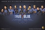
 Well by now you know all of the above is old news. Kozlov, otherwise lovingly known as "Mr. Automatic" in the shootout, is back with ATL. X has also resigned. As a fan fav, it's good to see X staying in Blueland as well.
But the question remains: Can the Thrash make the playoffs again? Will Atlanta hockey fans be able to again experience the magic that is The Stanley Cup Playoffs? (Maybe it's supposed to be "are the Stanley Cup Playoffs"... I'm not going to do dig up my AP Style Guide at the moment, K?)
And in case you've been living under a rock, or perhaps in the new pothole in NYC (ok that was mean) the Thrashers have launched their new website based on the NHL publishing system. While the site does make it easier for content providers to focus on content rather than site management, it also has the same look and feel as every other NHL team's website now. MLB did this years ago as well. But now every site is a cookie-cutter type site. The individualism is gone. Each team previously had it's own, unique look, feel, layout and style to it... and now that uniqueness is all but gone. The good news is that nothing that was there previously is missing; in fact there is a lot more content already, even before the season has started. But at the same time, it's also sad that the days of having your own website are gone. Some websites, such as the Blackhawks website, have a giant sponsor logo smack right in the middle of the top team logo banner, such as the giant at&t logo on their page. Now, thankfully, the Thrashers don't have a giant corporate logo plastered on the head banner.
While it is good to have NHL news on the front page... most fans visit their team's site first.. but you can also view this as a total waste of space; if I want news from around the NHL, then I'll go to NHL.COM or other hockey websites... this space could be used for something else.
But the best news is that for the casual user who may visit the site just every now and then, things look different yet familiar; many of the graphics are the same or similar enough.
When the site went live today at noon, there was instantly a new post on the message boards about it... and the Thrashers web crew was there to see what the fans had to say. I had noted that on the old site, directly on the home page was a link to the message boards, and on the new site, it was no longer there. Not even 5 minutes later, they added the link to the message boards on the home page. I guess you can thank me for that... at least you don't have to go to the menu to get to the boards.
There is more stuff under the Fan Zone for fans to check out than there is for most other teams. The wealth of multimedia is astounding and is more than enough to keep fans entertained during the offseason and between games.
Other good news is that, of course, you can still go to the website the same way (www.atlantathrashers.com) and you don't have to remember to type in thrashers.nhl.com.
The blocky look and feel does give it kind of a MySpace look and feel (that is if you don't pimp out your MySpace profile too much). It will take a bit of getting used to; but it could also be a lot worse.
The one thing missing that some teams have is a mobile version of the site. The Hurricanes have one. These sites are formatted for use on devices that are Windows Mobile, Palm, Blackberry, etc. based. They have updates and news and are great for keeping up with your team's news on the go... hopefully the Thrashers will consider doing one. You can check out the Hurricanes' mobile site here. Don't worry, it'll work in a normal PC / Mac browser just fine.
Well, the above paragraph is wrong. I just tested the same URL as the Hurricanes instead with the Thrashers, and low and behold, there is a mobile version there. I don't even think they've linked to it anywhere, but it's located here. Be sure to bookmark it on your smartphone!
Another thing I've noticed: The team banner at the top of the home page used to have several players, and in fact it used to rotate images and had different players and groups of players. With the new site, it is just one static image with Kari. I love seeing Kari there, but I did like having the random images up there. It was a small surprise every time you went to the site.
The stats are another amazing feature on the site. They have stats all the way back from the 2000-01 season and on. Why the 1999-2000 inaugural season stats aren't up there is beyond me; I hope they add them in.
I had the privilege of meeting Ben, otherwise once know as The Web Guy, last season at the Thrashers Blog Night. I'm hoping they do that again this season. The view from the press boxes are awesome. Ben and his web team did a great job with the new site and the content is going to be insane during the season. I am looking forward to it.
While a few things could be better and improved on, for the most part, it's a great new site. Let's hope that with the great new site comes a great new season.
August is just around the corner and then September hits and training camp and pre-season games start, so hockey is not as far away as you think!


No comments:
Post a Comment